Pages

Showing posts with label color blending. Show all posts

Sunday, September 25, 2016

The Good, The Bad and The Ugly


As I was thinking about the title for this week's post, the movie titled The Good, The Bad and The Ugly came to mind. The good would represent the lesson I thought was incredible! (Just really happy with.) The bad would be the one I kind of have reservations about...... (The little ones had fun with it and did learn something.) AND since I really adore kid's art work- the ugly would be how messy the tables looked afterwards. (Which I neglected to photograph.)

The good: The lesson I'm working on with my 2nd to 5th students is all about lines, shapes, patterns and space.

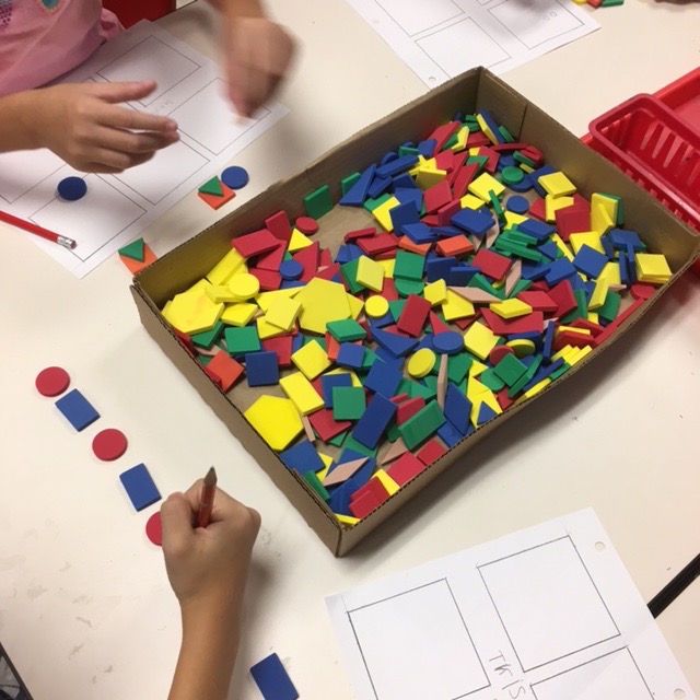
I was given a tub filled with these wonderful foam shapes. My grandson helped me to load up a cardboard tray for each table. I also put out markers and gave students paper with 6 boxes on it to work out their patterns and have a reference sheet for themselves. 
 After a short discussion followed by my modeling with my Elmo (a document camera).

 Students got to play and plan out their designs.
 It was amazing to see how engaged the students became. They also did a great job cleaning up. We will use these sheets in some very interesting ways in the very near future! And of course I will blog about it!

The bad: The lesson with my kindergarten and first graders. I have seen the little rainbow umbrella person all over Pinterest and thought, "What a cute blending primary into secondary rainbow lesson."

 The book I read to students was A Rainbow of My Own by Don Freeman.

I however didn't want to do a full on paint lesson and decided to use these gel sticks from Faber-Castell. The gel sticks when applied to paper have a crayon like texture until you add water with a paint brush and smooth out the texture. A really cool effect! This seemed so quick and easy that I didn't even bother with paint trays........ mistake #1.
Mistake #2 not making sure that the little kindergarten students understood that my tracers are NOT part of their art......
Mistake #3 was using paint brushes that were too big-in other words could hold way too much water and flood their project......

I managed to correct all mistakes by the second day and I did enjoy listening as the children were blending their colors. Soooo if my learning objective was for students to understand how to use primary colors to make secondary colors - then this was a good lesson. 


And while they may seem to all look alike, they really do have their own personality. My reservation is that I would really like to see students do something else to make them a little more unique, but I'm at a loss. All suggestions gratefully appreciated!! I'm thinking students could fill in the background.....

And like I first wrote, the ugly was the mess. Which was no big deal........ it is an elementary art room after all.

I would love to hear about your good, bad and ugly experiences!

Thanks for reading!  
Please share, I'm real close to 50,000 page views and this blog is having a 2nd birthday next month!




Sunday, May 31, 2015

Blending Analogous Colors

 For years I have motivated my primary students with picture books relevant to the art project that I planned to teach them. But, since last summer, when I had the opportunity to take not ONE, but, TWO teacher institutes, in DC, I have started to incorporate art posters to motivate my students in ALL grade levels!

I learned magnificent ways to incorporate art posters into my teaching. You can find one of those activities here.

Getting incredible feedback from students when using the art posters, has motivated me to pull out, and plan lessons around them.

And that is what I did last week in my art room.  My inspiration was Helen Frankenthaler's painting titled Blue Atmosphere.  Students were encouraged to look at the reproduction poster and tell me what they thought about it. And why. Most of them liked the colors, how they blended and how they could find different shapes in it. Some didn't like the color red or that it was abstract. I was glad they were able to share that with me. I did a really short power point to show my students more of Frankenthaler's work along with photos of her working in her studio.

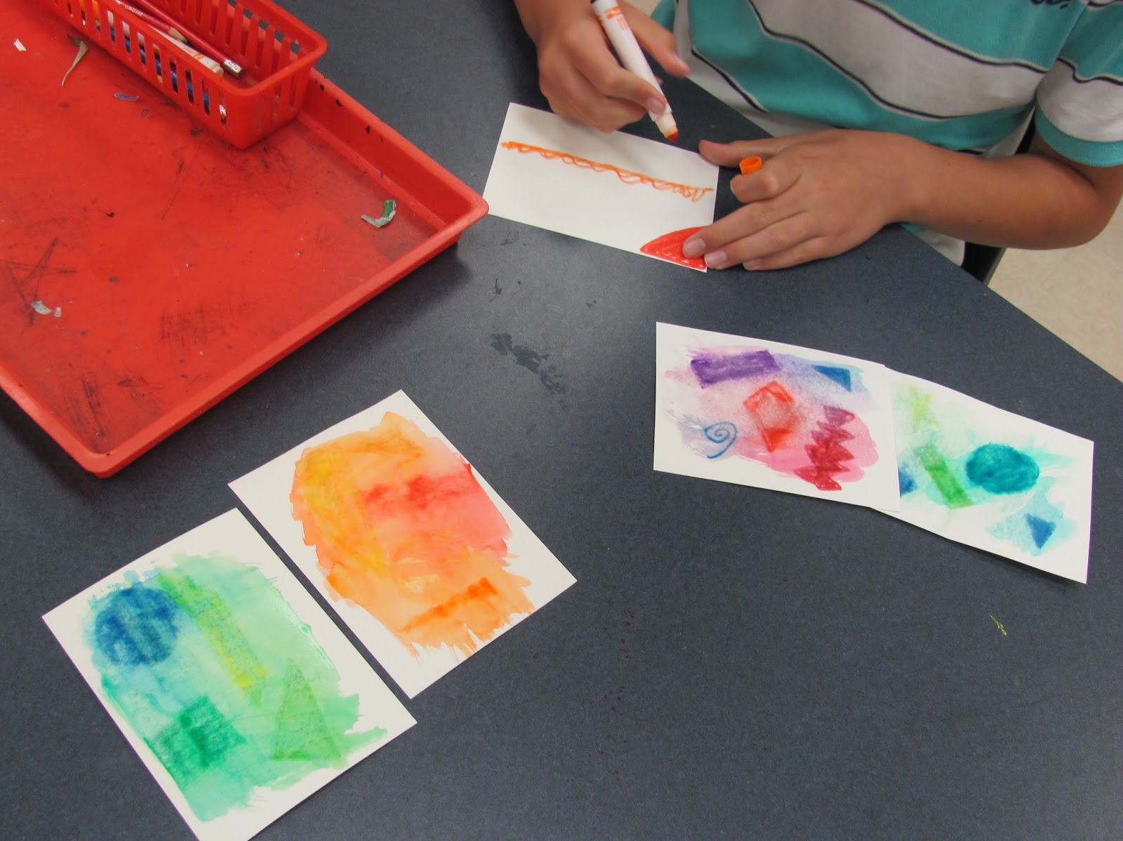
 I modeled for the students how I used (water soluble) markers to make shapes-both geometric or organic and how I used a paint brush with water to spread out or dilute the colors and we watched how they blended together.

Then I explained to them how I had set up the tables with analogous colors which are colors next to each other on the color wheel. And that I did this so their work would not turn brown, by accidentally using complementary colors. At the red table they would find red, yellow and orange markers. Yellow table had yellow, blue and green markers. And red, blue and purple were on the blue table.  They were expected to do 3 different pictures, one at each table on watercolor paper.

 When students were finished I had them display all three pieces together and hold a discussion with their table mates. They were to pick out the best one and explain why, tell which order they were done in and decide if we could tell that they were all by the same artist. Was there something that tied them together?

This simple project was really enjoyed by my students. I loved listening to them discuss all the colors they made when blending them and how excited they got. The funny thing is I don't even know what made me think of using markers to do this.  Except, of course, all the paint had been packed up. The gel sticks from Faber-Castell would have worked for this project........yes..... that's been packed up!

Three more student contact days and two more afterwards to finish packing... taking a deep breath!

Thanks for reading!!!